






 Faded BerryFaded CreamFaded NavyFaded Rust


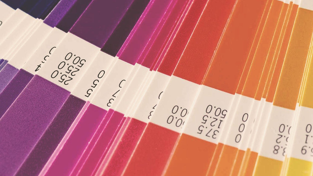
What is a Pantone color and why are they used?
The Pantone Color System, also known as PMS, is a global standard for color matching. It was developed to help printers and designers specify and control color in print. It also lets you specify colors that standard CMYK can't reach.
We keep color accurate by assigning a Pantone spot reference to each color in your design. Ink is mixed to those references, so the exact shade is what prints.
Our team checks the final print against a Pantone fan book under natural light to confirm the colors are accurate. With the Pantone Matching System as our color foundation, prints stay consistent across every product.
Pantones, being tangible printed hues, cannot be accurately depicted on a screen, as the calibration of each computer monitor varies. When a design is saved as a .jpg or .png, the colors are converted to RGB for screens, and RGB can't reproduce a Pantone ink exactly. Saving as a .jpg can shift color further because of compression.
The letter after a Pantone number tells you which paper the color was matched on. C means coated, a glossy stock where ink looks richer, and U means uncoated, a matte stock where it looks softer. On screen they look almost the same, but printed side by side you'll see the difference.
You can trust us to accurately represent your artwork and deliver repeatable results.
Need a starting point? Browse our Pantone color guide.



Leave a comment
This site is protected by hCaptcha and the hCaptcha Privacy Policy and Terms of Service apply.